The data access services are the main functionalities of EO-CAT. They consist in :
Catalog searching using dataset geo-temporal criteria and/or dataset inherent criteria
Retrieving products metadata and data
Downloading your products
Visualizing and manipulating data on the map.
The first and necessary step to make a catalog search is to
choose at least one dataset. The dataset selection widget is accessible by clicking on
the  button.
When the button is clicked, the widget is opened and it displays
the list of available datasets.
button.
When the button is clicked, the widget is opened and it displays
the list of available datasets.
Each dataset is represented by its name and the number of items it contains (displayed at the right of the name). '?' means that total number is not known.
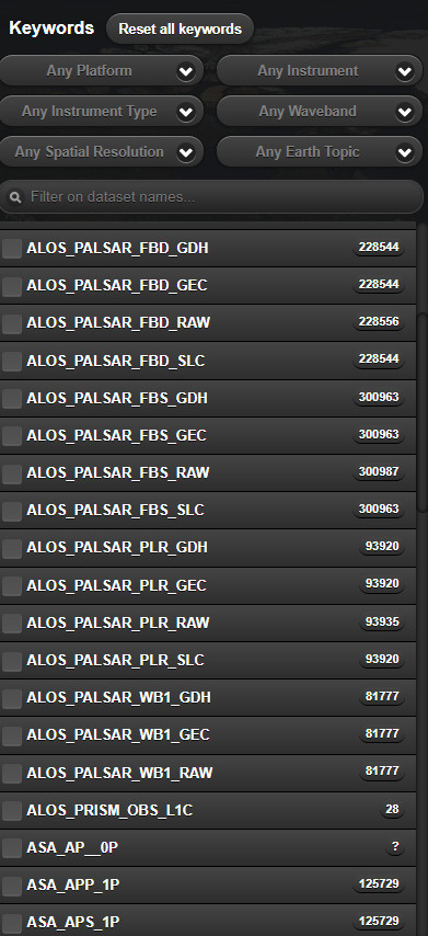
To select a dataset, the user has to scroll out the list and choose the dataset by clicking on the list entry. It is also possible to filter the available list of datasets by the means of the filter combo boxes.
By default, entire criteria are set to "Any". Once a criterion is chosen in one of the combo boxes, the datasets are filtered according to the selected keywords and the list is updated, taken into account the other combo boxes selected criteria.
In order to disable the filtering for a criterion, set back the selected option to "Any" or click on the button "Reset all keywords".
You can also filter on the datasets names by entering the name you wish in "Filter on dataset names ..." widget
Once at least one dataset has been selected, to set the search criteria, the user has to click on the 'Filters' button at the bottom of the 'Datasets' button. The search criteria widget is then displayed.
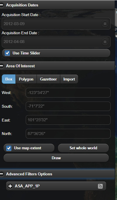
Clicking on the 'Acquisitions Dates', will open criteria for dates. Cliking on the 'Area of Interest', will open criteria for the area of interest. The 'Advanced Filters Options' is composed of several accordions, each accordion displays advanced search criteria parameters depending on the chosen dataset.
The Search button submits the search request to the server in order to retrieve the results. See Section 2.2.1, “Results table”.
 The openSearch url to
submit is created according to all the criteria selected inside
the search criteria widget.
The openSearch url to
submit is created according to all the criteria selected inside
the search criteria widget.
The search criteria types are :
They consist in the start and stop dates of the selected
dataset. In order to change the selected date, click on the
icon  to
display the calendar widget.
to
display the calendar widget.
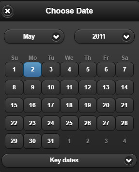
Choose the month and year using the combo boxes, then click on the day date. The calendar widget is closed and the chosen date does appear in the text field.
It is also possible to change the dates using a time slider. To enable the time slider, tick the checkbox  .
The search widget is then hidden and the timeSlider is displayed in the bottom of the map.
.
The search widget is then hidden and the timeSlider is displayed in the bottom of the map.

Drag the time bar to move and change the time range.
It is also possible to move the time slider bar by clicking on the left and right arrows of the time slider. The bar is then moved respectively to the left or to the right.
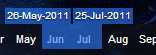
Drag the bar left handle and the bar right handle to enlarge the time range or to make it smaller.
Each time the bar is moved or resized, a search is launched and the results are displayed on the map.
The date criteria are applicable for all selected dataset.
They consist in geographical criteria to be used in the search.
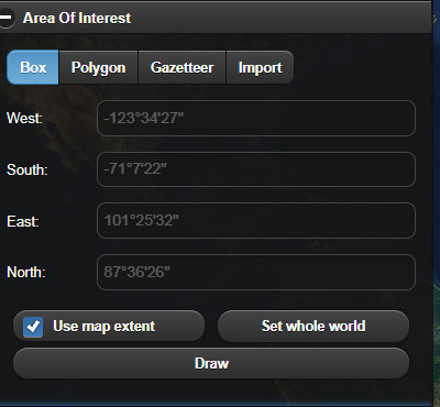
The area is created using either a rectangular zone, or a polygon, or a Gazetteer or can be imported from a file.
A rectangle search area or a BBOX is defined by :
West: the maximum longitude
East: the minimum longitude
North: the maximum latitude
South: the minimum latitude
By default, the coordinates are synchronized with the map
extent. To disable this behavior, uncheck the  check box.
Thus the coordinates can be entered manually in each text field.
check box.
Thus the coordinates can be entered manually in each text field.
A Polygon search area is defined by its coordinates.
To enable drawing polygons, click on the Polygon button in the area widget. The polygon definition view is displayed.
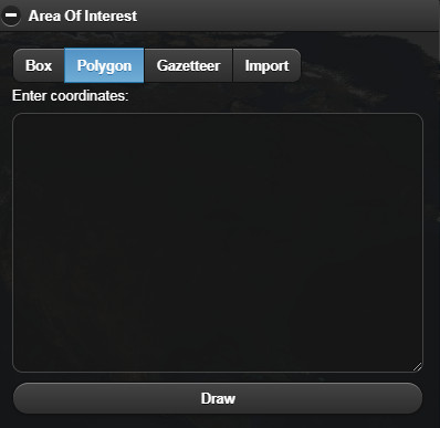
Enter the polygon coordinates in the text field under 'Enter coordinates:' and then press the Draw button.
It is also possible to draw a polygon or bbox using the mouse. On the 'Polygon' or 'Box' view, press the 'Draw' button, then click on the map to select a polygon edge. Move the mouse to choose another point and so on. When all the points are chosen double click to finish the definition of the polygon. The polygon widget is then displayed with the polygon coordinates.
To Reset the polygon, click again on 'Draw' button and draw again
A Gazetteer search area can be defined by clicking the area widget. The gazetteer view is displayed.
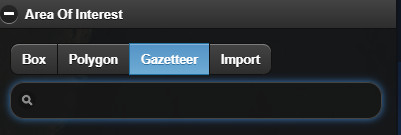
Enter the location to search in the text field and then press Enter.
The location items retrieved from the server are displayed in a list.
Click on the chosen location to define the search area.
To import a search Area, click on the "Import" button in the area widget. The import view is displayed.
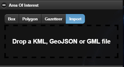
Drag a KML, GML or GeoJSON file from the file system and then drop it in the Drop zone of the import view.
 Only KML, GML and GeoJSON files can be imported.
Multiple areas are not supported
They are criteria relative to the selected dataset, so they change depending on the chosen dataset.
Different datasets
can have the same criteria.
To visualize the advanced criteria, click on Advanced Filters Options tab inside the search filters widget.
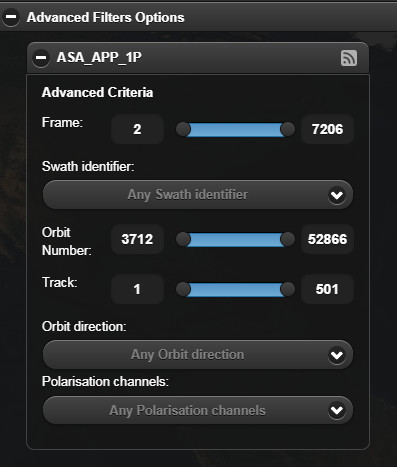
Each criterion is displayed by its name and a selection widget. Criterion having a range are displayed with sliders. Move the slider or set the value inside the text field to change the selected value. Criterion having a multiple selection possibilities are displayed with a list of possible values. Tick or untick the check boxes to change the criterion selected value.
The Advanced Filters Options are displayed per chosen dataset.
Clicking on the button "Atom feed", the request is open on another browser tab using the opensearch format
Once the search criteria have been filled in and the Search button clicked,
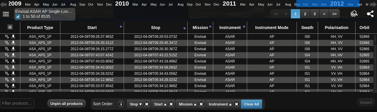
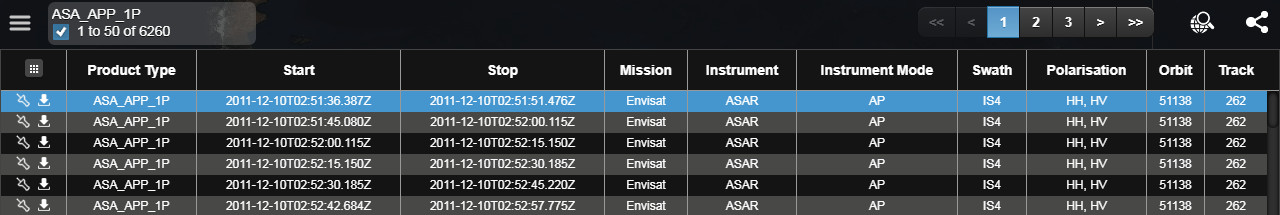
the results are shown at the bottom of the page as a table of product metadata values.
Click on the table button  to display the results table.
The results table can
be hidden by clicking on the button on
the toolbar.
Selecting a product in the table automatically displays its footprint and browse image (if any) on the map.
The navigation buttons (page numbers, next/previous, first/last) in the results table allow pagination through the full list of results  . Each page of the table displays up to 50 results.
Some table column can be sort.
- Columns with non-sortable data have the
 icon (displayed when the mouse is over this column).
 - Sorting results is performed by clicking on column headers.
- The
 icon appears near the header when data are sorted in ascending order.
 - The
 icon appears near the header when data are sorted in descending order.
 - Otherwise (no sort action), only title is displayed in the header.
- Multi-column sorting is performed by shift-clicking on column headers. The sort session/column order is preserved in the order the columns were clicked.
- With using the shift-key AND with multiple columns sorted: clicking on an already sorted column goes through the cycle “ascending -> descending -> unsorted -> ascending …”.

The "Sort Order" list displays the current sorting order. You can click on a sort button to remove the sorting, or "Clear All" to remove all sorting.
The field "Filter products" allows to filter results according to the entered text.
The Pin Button allows to keep displaying the browse image (if any) in the map, even if the product is not selected.
The "UnPin all products" Button allows to remove all displayed browse images from the map.
The Direct Download is a functionnality making the user download the retrieved products if they have a url starting with http or https. Click on the button "Download" to download the product.
For a downloadable product, click on the download icon  .
.
A popup is displayed.

Select "Via Browser", the product is then downloaded via the browser native downloader.
vizualize the products footprints
navigate on the globe
choose search area coordinates
display product browse images
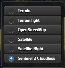
vizualize map layers
choose map background
Click on the 2D/3D  button on the toolbar to change the map mode
from 2D to 3D and inversely.
button on the toolbar to change the map mode
from 2D to 3D and inversely.
In order to 'zoom in':
Either click on the Zoom In
 button on the toolbar
or move the mouse wheel in.
In order to 'zoom out':
Either click on the Zooum Out
 button on the toolbar to zoom out.
 or move the mouse wheel out.
Click on the Start View  button on the toolbar to return back to the initial view.
Once a catalog search is done and the products are retrieved, the related footprints are drawn on the map.
Click inside a footprint:
The product is selected on the results table
The browse (if any) is automatically displayed in the map inside the selected product footprint
A popup widget is displayed with information on the selected product
Click the "Pin/Unpin" icon in the table or in the information popup widget
 in order to always display the browse image (if any) inside the footprints (event if the product is not selected).
The icon
allows downloading the product.
To access the map layers, click on the layers icon on the toolbar  .
.
The layers widget is displayed.
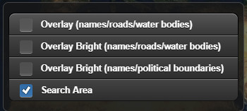
To add an overlay layer, just check the checkbox associated to the overlay layer you want to add in the map.
To remove a layer from the map, just uncheck the checkbox associated to the overlay layer you want to suppress from the map.
 .
.